rent-now

Rent More, Save More! Use code: ECRENTAL

5% off 1 book, 7% off 2 books, 10% off 3+ books

9780133888218

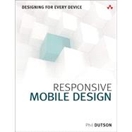
Responsive Mobile Design Designing for Every Device

by
  • ISBN13:

    9780133888218

  • ISBN10:

    0133888215

  • Edition: 1st
  • Format: Paperback
  • Copyright: 2014-09-18
  • Publisher: Addison-Wesley Professional
  • Purchase Benefits
  • Free Shipping Icon Free Shipping On Orders Over $35!
    Your order must be $35 or more to qualify for free economy shipping. Bulk sales, PO's, Marketplace items, eBooks and apparel do not qualify for this offer.
  • eCampus.com Logo Get Rewarded for Ordering Your Textbooks! Enroll Now
List Price: $39.99

Summary

Create Web Designs That Work Perfectly on Any Device—Simply and Beautifully!

Billions of people access the web via smartphones, tablets, and devices of all types, using every imaginable interface and display. But they all want the same thing: the right information, right now, delivered in the most aesthetically pleasing way possible. Give them what they want with Responsive Mobile Design .

Whether you’re a developer, designer, or manager, Phil Dutson teaches you principles, techniques, and best practices for delivering a successful experience to all users on all devices.

Dutson shows how to design sites that are responsive “from the start,” while keeping development simple and flexible. Next, he delivers complete technical know-how for transforming responsive designs into responsive sites. You’ll find coverage of key issues such as integrating media content, optimizing performance, and serving Retina or high-density displays.

Throughout, he combines detailed and practical explanations with functional, easy-to-reuse code snippets.

Coverage includes
•    Demonstrating why “mobile first” is still a best practice
•    Fusing content, structure, and beauty to deliver experiences users love
•    Using responsive images to improve speed and convey visual messages more effectively
•    Using grid systems without making it feel like your design is “locked in a box”
•    Mastering measurement values such as px, em, rem, and viewport units—and understanding their crucial differences
•    Improving the finer details of your design with web fonts
•    Retrofitting current websites to prepare them for the future
•    Introducing web components into your HTML markup
•    Using built-in browser development tools to streamline debugging and “in-browser” prototyping

Author Biography

Phil Dutson is the UX, Mobile, and Lead eCommerce developer for ICON Health & Fitness. He is also the Author of Sams Teach Yourself jQuery Mobile in 24 HoursjQuery, jQuery UI, and jQuery Mobile Recipes and Examples, and The Android Developer’s Cookbook (2nd Edition).

Table of Contents

Introduction: What Defines Responsive Web Design

Section 1: Creating a Responsive Layout
1. Content Matters
2. Why Mobile First
3. Working with Grids
4. Displaying Tabular Data
5. Working with Measurement Values
6. Using Media Queries
7. Typography
8. Retro-fitting an existing site

Section 2: Working with Responsive Media
9. Responsive Images
10. Responsive Video
11. Image Compression

Section 3: Enhancing Performance
12. Conditional JavaScript
13. Web Components
14. Client Hints
15. Server-side Optimization
16. High Performance with Development Tools

Supplemental Materials

What is included with this book?

The New copy of this book will include any supplemental materials advertised. Please check the title of the book to determine if it should include any access cards, study guides, lab manuals, CDs, etc.

The Used, Rental and eBook copies of this book are not guaranteed to include any supplemental materials. Typically, only the book itself is included. This is true even if the title states it includes any access cards, study guides, lab manuals, CDs, etc.

Rewards Program